In 2011, Canon initiated a review of their e-manual content for their range of multifunction printers. Content was generated in HTML format and was also made available on a CD-ROM.
Canon wanted a more user friendly manual and requested proposals from six technical communication companies. The team at Hansem was included in the group and we quickly formed a team to formulate our response
LS Div.
We decided to focus on four key areas:
- Updating the TOC and transforming it from a traditional hardcopy manual layout to one that better aligns with an HTML format.
- Integrating topic-based headings into the TOC’s structure to provide clearer access points for users.
- Redesigning the instructional content in each module to make it more effective.
- Introducing sustainability and efficiency information features into the manual.
After the direction of our proposal was agreed, the team documented our approach and prepared a range of sample illustrations and modules to submit to Canon.
Our proposal was selected as meeting Canon’s requirements and was adopted as their template for all of their service providers that create content for multifunction printers. Following the transition to the new template, the e-manual standard, developed by Hansem has successfully communicated the technology to users since 2013. This article covers several of the areas that were included in our proposal and were subsequently adopted into the current Canon e-manual format.
Content configuration
Our main focus was the configuration of the TOC. We inserted hyperlinks, corrected repeated or contradictory listings, and modified the structure of the TOC and the headings. The modifications to the TOC made it easy for the users to identify sections by topic and match the task they wanted to perform. Hyperlinks in the TOC enabled quick and direct access to the information the user requires.
 Streamlining the TOC
Design elements
The updated design focused on enhancing usability and navigation directly from the cover page. A central navigation dashboard was prominently positioned on the cover page of the manual. Easy to read and identify, its design focus helped users find and navigate to the activity they wanted to perform. We included visual cues that were designed to indicate the importance of various elements and information. The visual cues included different text sizes, colors, images, and designated locations for critical elements.
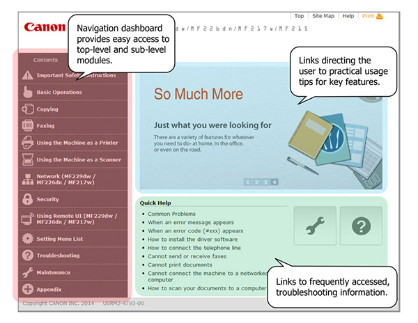 Cover page design and layout
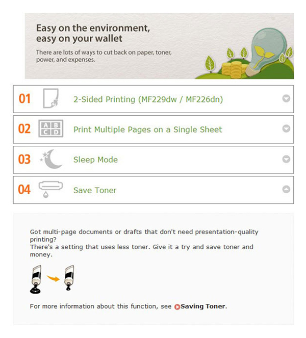
Sustainability and efficiency
Our analysis of the client and their customers identified sustainability and efficiency as important factors in the way they make decisions. We created a separate repository for content of this nature and called it “Featured Highlights”. The repository contains four content categories.
- Going Green and Saving Money – easy on the environment, easy on your wallet
- Going Digital – from reams of paper to compact data
- Improving Efficiency – little things that save lots of time
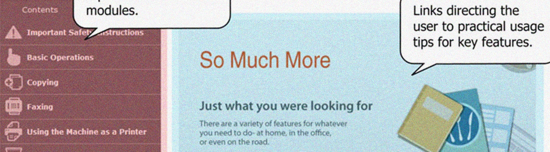
- So Much More – just what you are looking for
The “Featured Highlights” repository serves as a marketing tool for the manufacturer to demonstrate their values, innovations, and new features to the users. From users’ perspective, it provides easy and quick navigation to other key features that can assist their workflow and their business.