When creating user manuals, document design refers to the process of structuring and organizing a document’s layout and visual elements. This involves designing the overall format, selecting fonts, arranging images, and applying colors to ensure that the manual is not only visually appealing but also easy to understand and use. In this article, we will explore the six key components of effective document design for user documentation.
Designing user manuals goes beyond simple information delivery. It emphasizes readability, clarity, and visual appeal, aiming to help users navigate the manual easily and efficiently. Here are the six core elements of document design that are essential for creating effective manuals: layout, grid, columns, eye flow, color system, and typography.
1. Layout
ㆍThe art of arranging text, images, icons, and symbols within a limited space to effectively convey information.
ㆍPrioritizes readability, clarity, structure, and user engagement.
Layout defines the overall structure and placement of elements such as text, images, and icons. It establishes how information is distributed on the page, creating a framework for users to easily follow.
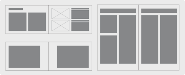
A well-planned layout directly influences user experience:
- It improves readability, helping users find the information they need quickly. When information is organized logically and consistently, readers can understand the manual without confusion.
- A good layout enhances focus, making sure that critical elements like headings, body text, images, and warnings are placed strategically so users don’t miss important details.
- A clear layout helps users follow installation steps or operating procedures accurately and safely by breaking down processes into visually distinct sections.
In summary, the layout is fundamental to how efficiently a user interacts with the manual. It is also the foundation for incorporating other design elements like grids, columns, and typography to enhance usability.
2. Grid
ㆍA framework of invisible lines that guides the organization of content on a page.
ㆍHelps maintain visual structure, ensuring readability and consistency.
The grid is an invisible structure that helps organize the placement of text, images, tables, and other content within a document. Think of it as a set of guidelines that divide the page into columns and sections, ensuring that all elements are positioned systematically.
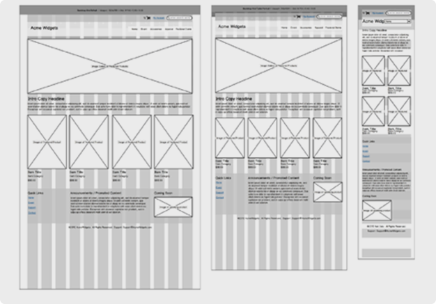
Key functions of the grid include:
- Providing a consistent structure so that content is uniformly arranged, giving readers a sense of order.
- Enhancing readability by aligning elements evenly, creating a clean and cohesive layout that’s easy to navigate.
- Maintaining visual balance, ensuring that no part of the document feels overcrowded or sparse, which reduces visual fatigue.
Ultimately, grids create the framework for clear, organized, and visually balanced documents that help readers focus on the content without distraction.
3. Columns
ㆍVertical sections that divide the page for text flow.
ㆍInfluences how easily text can be read by managing line length.
Columns divide a document into vertical sections, making it easier to organize and present large amounts of text. By breaking down content into smaller, more manageable sections, columns improve the overall readability of the manual.
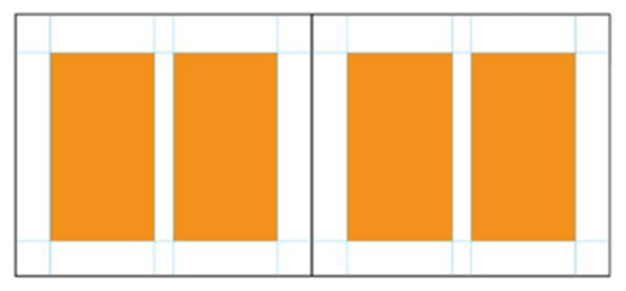
Key roles of columns include:
- Improving readability: Multiple columns allow for shorter lines of text, reducing eye strain and making it easier for users to follow along. If a single column is too wide, it can be difficult for readers to stay focused on the content.
- Organizing information: For instance, a manual might place instructions in the left column and images in the right, making it easy for readers to connect text with visuals.
- Providing visual balance: Evenly spaced columns create a professional and clean look, helping readers navigate the content more efficiently without feeling overwhelmed.
In short, columns are essential for keeping text well-organized and easy to follow.
4. Eye Flow
ㆍStrategic placement of visual elements to guide the reader’s attention.
ㆍDirects readers through the document in a logical order, ensuring that critical information is highlighted.
Eye flow refers to how visual elements like text size, color, and images are placed to guide the reader’s gaze through the document. By influencing the order in which information is processed, eye flow helps ensure that critical details are noticed.
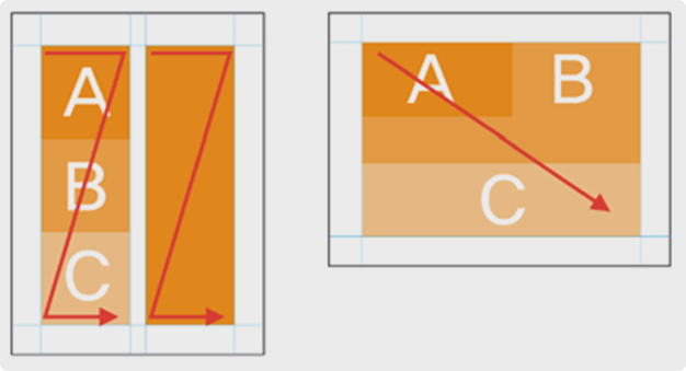
Benefits of effective eye flow include:
- Emphasizing important information: By using colors like red or yellow for warnings or crucial instructions, users are naturally drawn to key points.
- Providing a natural reading order: Strategic placement of text and images directs readers to follow information logically, avoiding confusion.
- Enhancing readability: Using different text sizes and colors helps to differentiate between headings, body text, and action items, making it clear where to start and what to focus on.
Incorporating a thoughtful eye flow ensures that users process the information in the most efficient and meaningful way.
5. Color System
ㆍThe strategic use of color to enhance attention, readability, and organization.
ㆍConsiders cultural sensitivities, using color as a tool to highlight or differentiate sections.
The color system adds visual depth to the design, using color to distinguish different sections, emphasize key points, and maintain user engagement. Unlike eye flow, which guides the reader through the document, color is used to signal meaning and hierarchy without disrupting the flow.
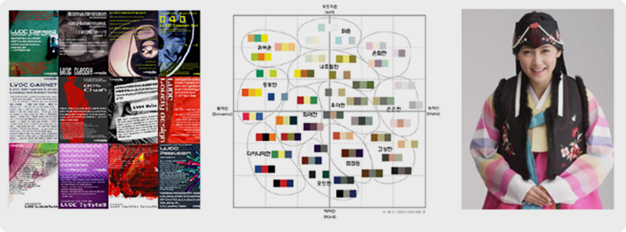
Key advantages of a well-applied color system include:
- Highlighting important information: Colors like red or yellow can be used for warnings, helping users quickly identify critical details.
- Improving readability: High contrast between text and background colors ensures that the content is easy to read.
- Enhancing user experience: Thoughtful use of color adds interest and visual appeal, keeping users engaged with the document.
- Cultural sensitivity: Colors can carry different meanings across cultures. For example, red is considered lucky in China but represents danger or rebellion in some African countries. Similarly, green is associated with nature and safety in Western cultures but has religious significance in Middle Eastern and some Asian countries. Understanding these cultural connotations is critical when designing global manuals.It’s important to be mindful of these cultural differences when designing global manuals.
Overall, color can be a powerful tool in enhancing the user’s experience and making information more accessible.
6. Typography
ㆍThe art of choosing and arranging fonts to improve legibility and clarity.
ㆍEnsures that the information is easy to read and understand.
Typography involves choosing and arranging fonts in a way that improves readability and helps convey the structure of information. In addition to font size, weight, and style, adjustments in line spacing (leading), character spacing (kerning), and paragraph spacing are crucial for enhancing readability and reducing eye fatigue. These elements can have a significant impact on how easy it is to read and understand a document.
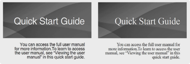
Benefits of strong typography include:
- Enhancing readability: Choosing the right font size and style (e.g., bold or italic) ensures that important details stand out and are easy to follow.
- Establishing hierarchy: Different font sizes and weights can help readers differentiate between headings, subheadings, and body text, making it easier to find specific information.
- Maintaining consistency: Using a consistent font style throughout the manual adds a sense of professionalism and order, making the document easier to navigate.
In conclusion, typography is a critical element in ensuring that a manual is easy to read and understand, contributing to an overall positive user experience.
Hansem Global’s Document Design Expertise
With over 30 years of experience, Hansem Global excels in the planning and development of user manuals, demonstrating a high level of document design expertise. Their approach to design plays a crucial role in the creation of consumer product manuals, especially in the global market, where overcoming language barriers is essential. Hansem Global’s graphic designers have consistently delivered exceptional design work across a variety of projects, reflecting the company’s competitive edge. For more information on document design services, Hansem Global is here to help.


