


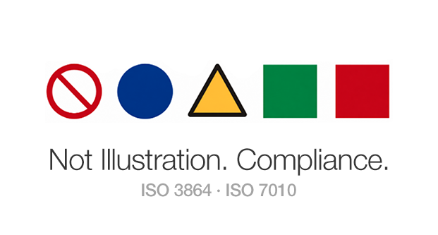

Most drawings in a manual are the writer’s call. A few are not. Those few have a fixed shape, and getting them wrong costs the document its credibility. This article covers where illustration and safety pictogram part ways, and which rules apply once you cross that line.
1. Instructional illustration vs. safety warning image
User manuals, service manuals, technical manuals — all of them carry screenshots, function icons, exploded parts views. Most of these only need to match the product, so they are not the problem here. Two categories call for judgment.
| Type | What the drawing does | How it is judged |
|---|---|---|
| Instructional illustration | Shows what to do and how to do it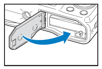 | Is it accurate? Is it easy to read? |
| Safety warning image | Signals what to avoid, what to comply with, and what hazard is present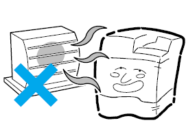 | Conformance to ISO 3864-1 and ISO 7010 |
An instructional illustration succeeds when it depicts the situation accurately enough that the reader knows what to do. A safety warning image works on a different standard. Depicting the situation well is not the goal; matching the specification is. A beautifully drawn warning with the wrong surround shape has failed. A crude one with the right shape does its job.
Why the line blurs
Both come out of the same file, drawn with the same tool, usually by the same person. The illustrator who drew the battery cover on page 12 draws the caution page on page 13. Nothing in the workflow announces that the rules just changed.
If you handle documentation for imported equipment, you have seen the result. Machines acquire eyes and a mouth. A bead of sweat appears when something goes wrong. The page is drawn in the grammar of illustration. That is the problem. Images of this kind are governed by rules.
A safety warning image is a pictogram
A safety pictogram is a visual mark that conveys hazard, prohibition, mandatory action, or emergency information through image alone, without words. It shows up on the safety pages of user manuals, technical manuals, and service documentation.
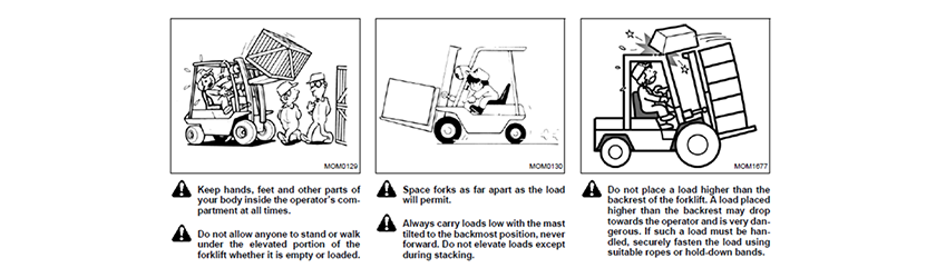

Drawing this kind of image is governed by rules. Of the three examples above, the first two do not follow them and the third comes close. What separated them is clear once the rules are on the table.
2. Safety pictograms follow drawing rules
ISO 3864 is the grammar. ISO 7010 is the dictionary.
Two international standards apply, and they do different jobs.
ISO 3864 specifies how a safety sign is built: which surround shape carries which meaning, what each color signifies, how far the inner symbol has to be simplified.
ISO 7010 is the catalog of symbols already built to that grammar and registered. Electric shock, hot surface, crushing, falling objects, eye protection, no open flame. Most hazards you meet on an industrial floor already have finished artwork waiting.
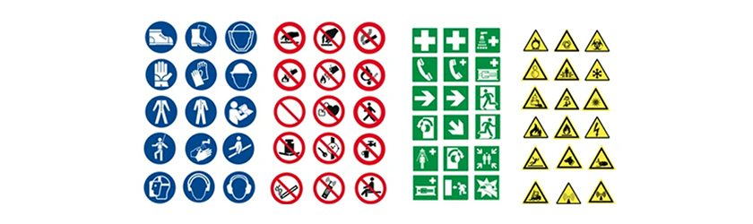
The working order is dictionary first. If the symbol you need is in ISO 7010, use it as it stands. There is no reason to invent one and no reason to ask a designer to draw one. You reach for the ISO 3864 grammar only when the catalog comes up empty.
Where ANSI fits
A reasonable question from a US reader: why is this article about ISO rather than ANSI? Because the two cover different parts of the job.
For the manual itself, ANSI Z535.6 is the standard to satisfy. It governs safety information in product manuals, instructions, and other collateral material — which signal word applies, how the message is worded, and where on the page it belongs.
What Z535.6 does not do is hand you the symbol. The shape grammar and the registered artwork come from ISO 3864 and ISO 7010. For manufacturers shipping to more than one market, standardizing on ISO 7010 is the practical choice, since a single drawing then serves every market.
The division of labor
ANSI Z535.6 — the words of the safety message and where they go on the page.
ISO 3864 and ISO 7010 — the image that goes with them.
Registered symbols carry a reference number, which turns out to be more useful than it sounds. Write “the electric shock symbol” in an email and everyone on the thread pictures something slightly different. Write W012 and there is exactly one drawing. Putting the number in asset requests and review comments removes a surprising amount of back-and-forth.

The surround shape is settled before the drawing is
In a safety pictogram, the inner drawing is the second question. The category is set by the shape around it.
| Meaning | Shape | Color |
|---|---|---|
| Prohibition | Circle with 45° bar | Red band and bar, white ground, black symbol |
| Mandatory action | Circle, no bar | Blue ground, white symbol |
| Warning | Equilateral triangle, rounded corners | Yellow ground, black band and symbol |
| Safe condition | Square | Green ground, white symbol |
| Fire equipment | Square | Red ground, white symbol |


These pairings are not interchangeable. The reader takes the surround shape before interpreting anything inside it. A triangle reads as be careful. A circle with a bar through it reads as do not. Only after that does the inner symbol answer what.
Which is why a warning image with no surround shape is a sentence missing its verb. A machine with a worried face carries no prohibition, no warning, no instruction. The reader gets a subject and never gets a predicate.
When the document prints in black and white
This is the question that comes up most in manual production. The body prints in one or two colors, red and blue are not available, and the budget will not stretch. What then?
Color is not the problem. The standards anticipate print conditions that make safety colors impossible, and in those cases meaning is carried by shape and contrast instead. A circle with a bar through it is a prohibition in single-color black. A triangle is a warning. Color is negotiable against a print budget. Shape is not.
Losing the color is a permitted constraint. Losing the shape is not.
What separated the three examples
Example 1 — every hazard gets the same mark
Operators are drawn as cartoon characters with exaggerated expressions, and a falling load arrives with impact stars. The drawings carry perspective, shading, and enough incidental detail to read as scene illustration rather than safety symbol.
Look at the marks beside the text and the real problem appears. Every entry gets the same triangle with an exclamation point. But read the entries: keep hands and feet inside the compartment, do not allow anyone to stand under the elevated portion, do not place a load higher than the backrest. Those are prohibitions, and prohibitions have a shape of their own.
One general mark standing in for six different messages tells the reader that something on this page deserves attention, and nothing beyond that. Which entry forbids an action, and which one describes a condition to watch for? The reader has to work it out from the paragraph, and by then the mark has done no work at all.
Example 2 — a prohibition drawn in the grammar of mandatory action
Both entries are prohibitions: do not disassemble or modify the camera, do not use it near flammable gas. The surround shape is a blue square.
Check that against the table above. Blue signifies mandatory action, and the square belongs to safe condition and fire equipment. The prohibition slot has been filled with the opposite grammar, so the first signal the reader takes from the surround contradicts the message inside it.
In fairness, the color has a defense
If this page printed in two colors, blue and black, then the absence of red is a print constraint rather than a design error. As noted above, the standards allow for exactly this. Demanding red here amounts to demanding four-color printing, which is not a realistic ask.
The bar is another matter. A diagonal bar does not care how many inks are on the press — black alone will draw it. Adding a circle and a bar costs nothing, and their absence is the real defect in this example.
This one is ours
Worth stating plainly: Example 2 comes from a manual we produced, roughly ten years ago.
This article would have been easier to write about somebody else’s document. At the time we did not think the page was wrong. We worked inside the print budget we were given, the icons were clean, and the page passed review. We simply did not know that the surround shape carries meaning.
Failures of this kind do not come from lack of skill. Work carefully without knowing the rules exist and this is precisely what you get. The harder you push to make the page look good, the deeper you travel into the illustration grammar, which is why this shows up more often in documents that received more attention, not less.
Example 3 — no color, and the grammar survives
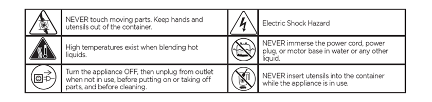
Printed in black and white with not one safety color available, and three categories still separate cleanly. Moving parts, hot surfaces, and electric shock get triangles. Turn the appliance off and unplug it before servicing gets a plain circle. Never immerse the motor base in liquid and never insert utensils while the appliance runs get circles with bars through them. Warning, mandatory action, prohibition — all three on one page, all three legible with no color at all.
The inner drawings are lean as well. No attempt to reproduce the actual product, no facial expressions, no perspective. Line weight stays consistent and the symbols hold up at print size.
Set Examples 2 and 3 side by side and the conclusion is hard to miss. The one with a full color budget failed and the one with no color succeeded. What separated them was not money.
Example 3 is not flawless either. The same page draws NEVER immerse and NEVER insert as circles with bars, exactly right. NEVER touch moving parts gets a triangle. Two prohibitions handled one way and a third handled another, on a single page. The rule was understood here. It simply was not applied evenly.
Strip the inner drawing down
If the surround shape names the category, the inner drawing names the subject. ISO 3864-3 covers this part, and a handful of points carry most of the weight in practice.
- Skip the perspective. Pick the single view — front or side — that shows the hazard most clearly and draw it flat. Depth does not help legibility and it collapses when the symbol is reduced.
- Do not reproduce the product. What has to travel is the type of hazard, not what the equipment looks like.
- Keep letters and numbers out. Independence from language is the whole point of a pictogram. Add text and it becomes a translation item that breaks in every other language edition.
- No faces, no anthropomorphism. Eyes, mouths, and sweat drops fail to specify the hazard while making the symbol harder to read.
- Hold line weight constant and use only the safety colors. Gradients, drop shadows, and brand palettes are all out.
One sentence for the designer: an instructional illustration improves the more you draw, and a safety pictogram improves the more you remove. That framing lands better than any checklist.
When the hazard is not in the catalog
ISO 7010 does not cover everything. Specialized equipment, new device categories, hazards defined by a local regulation. This is where the ISO 3864 grammar earns its keep.
Before committing to a custom symbol, check two things. First, whether it already exists under a name you did not search for. Registered symbols are indexed under formal titles, and plain description misses them — pinch points are filed as crushing of hands, and getting caught in machinery as entanglement. Second, whether a general warning or general prohibition symbol paired with specific wording will carry the message.
Avoid custom symbols where you can, because every one you create adds a drawing the reader has never seen and has to decode.
If you do have to draw one, the sequence is short. Settle the category first — prohibition, mandatory action, warning — and the shape and color follow automatically. The only part that calls for invention is the inner drawing. Study how comparable registered symbols handle hands, people, heat, or vibration, and you inherit a visual vocabulary the reader has already learned.


Then verify it. The person who drew the symbol cannot judge it, because they already know what it means. There is a formal method for measuring comprehension — show the symbol alone and ask what it says. Even without running a formal test, putting it in front of ten people who do not know the product will catch most of what is wrong.
3. Putting it on the page
Everything so far has been about drawing the pictogram. What remains is what happens when it lands in the document. A well-made symbol can still come apart during production.
Reproduce to the standard rather than draw from scratch
In practice, symbols going into a manual are usually redrawn from an image someone found in a search. The trouble is that search results mix registered artwork with variants that someone else already redrew. Copy a drawing that has drifted and you add another layer of drift on top.
You do not have to change how you work. You do have to be deliberate about the source. Fix the reference number first, then search on the number. “Electric shock symbol” returns every variant in existence. W012 returns things close to the registered artwork.
What to hold onto when you redraw
The shape rules from the previous section apply directly here, because redrawing means setting the geometry again from the beginning.
- The bar runs at 45°, upper left to lower right
- Equilateral triangle, corners only slightly rounded
- Band weight kept as it is, never thinned
- Inner symbol position and proportion measured against the original
Then comes the urge to tune it to the document’s look. Thin the line. Swap the color for the brand palette. Round the corners a little more. Each adjustment is small on its own, and together they produce a drawing that no longer matches the standard.
A safety symbol is not part of your document’s design system.
When the brand guide and the safety symbol conflict, the symbol wins. One line in the style guide spares you from arguing it on every project.
Keep what you draw
The same symbol comes up again on the next project. Search for it again, redraw it again, and you get a slightly different drawing every time.
Collect the symbols you have drawn in a shared library, filed under their reference numbers. One file holding the number, the name, and the standard wording means nobody redraws it next time. Managing the wording alongside the artwork also stops the same symbol from picking up a different translation in every language edition.
Write down what it means
Sound artwork is not the end of it. A pictogram can say “there is a hazard of this type here” and no more. How serious it is, what happens if you ignore it, what to do instead — none of that fits in a drawing. That is the ceiling of what an image can carry.
Which is what the symbol legend is for. Collect every symbol used in the document near the front and state what each one means. Plenty of manuals still ship without a legend at all, and a symbol placed with its meaning recorded nowhere leaves the reader guessing.
Conclusion
Safety pictograms look like a design matter and behave like a compliance matter. The question is not whether the drawing is good but whether it is correct, and most of the time the work is finding the existing symbol rather than making a new one.
The person who makes that call is usually the technical writer. They decide what to ask the designer for and whether the drawing that comes back goes into the document as-is. Knowing that the rules exist changes most of what follows.
Frequently asked questions
- Which drawings in a manual count as safety pictograms? Any drawing that signals a hazard or conveys a prohibition or a required action. Illustrations that show how to operate the product are judged differently: an illustration only has to be accurate and easy to read, while a safety pictogram has to match the shapes defined in ISO 3864-1 and ISO 7010. The test is simple. Delete the drawing and ask what disappears — reading speed, or a hazard warning.
- What is the difference between ISO 3864 and ISO 7010? ISO 3864 is the rulebook for building a safety sign. It defines which surround shape carries which meaning, what each color signifies, and how far the inner symbol must be simplified. ISO 7010 is the catalog of symbols already built to those rules and registered, covering electric shock, hot surfaces, crushing, and most other hazards found on an industrial floor. If the symbol you need is in ISO 7010, use it as it stands. Turn to the ISO 3864 rules only when the catalog does not have it.
- Do ANSI standards or ISO standards apply to safety symbols in US manuals? For the manual itself, ANSI Z535.6 is the standard to satisfy. It governs safety information in product manuals, instructions, and other collateral material — which signal word applies, how the message is worded, and where on the page it belongs. What it does not supply is the symbol artwork. The shape grammar and the registered drawings come from ISO 3864 and ISO 7010. Manufacturers shipping to more than one market generally standardize on ISO 7010, since a single drawing then serves every market.
- The manual prints in black and white. How do we handle the safety colors? Carry the meaning in the shape. The standards anticipate print conditions that make safety colors impossible and allow shape and contrast to do the work instead. A circle with a bar through it is a prohibition in single-color black, and a triangle is a warning. Losing the color is a permitted constraint; losing the shape is not. The real failure mode is the opposite case — a document with color available where prohibitions and mandatory actions are drawn in the same shape.
- How do prohibition, mandatory action, and warning differ in shape? A prohibition is a circle with a 45° bar across it. A mandatory action is a circle with no bar. A warning is an equilateral triangle with slightly rounded corners. Safe condition and fire equipment both use squares. Readers take the surround shape before they interpret anything inside it, which is why a warning image with no surround shape is a sentence missing its verb.
- What do we do when the hazard is not in ISO 7010? First confirm that it really is not there. Registered symbols are indexed under formal titles, so plain description often misses them — pinch points are filed as crushing of hands and getting caught in machinery as entanglement. A general warning or general prohibition symbol paired with specific wording will also solve many cases. If you still have to draw one, settle the category first and the shape and color follow, leaving only the inner drawing to invent. Test the result on people who do not know the product, and record its meaning in the manual’s symbol legend.
- Where do safety pictogram files come from? In practice most teams redraw them from an image found in a search, and the difficulty is that search results mix registered artwork with variants somebody else already redrew. Fix the reference number before you search, then search on the number. “Electric shock symbol” returns every variant in circulation; W012 returns artwork close to the registered original. Once you have a clean version, file it under its number with its name and standard wording so the next project does not start over.
Hansem Global is Korea’s first technical writing company, founded in 1990. We develop technical documentation for industrial equipment and manufacturing to international standards, and localize it into more than 50 languages. We consult on documentation projects that require safety information design and standards compliance.