


Premium home appliances, beauty devices, wellness devices, and consumer medical devices often have highly designed user manuals. The English version may look polished, but localization can quickly expose layout problems as text expands, tables shift, and images move.
For better quality and more efficient multilingual user manual production, documentation teams should not wait until multilingual desktop publishing (DTP) to fix these problems. The source manual should be designed for localization from the beginning.
Why Highly Designed Manuals Are Harder to Localize
Consumer product manuals are not simply containers for accurate information. Product images, icons, white space, color, and step-by-step instructions all contribute to the user experience.
Beauty and wellness devices often need to present procedures and precautions clearly within a small page size. Consumer medical device instructions for use (IFU) may need to fit operating information, safety information, and labeling-related content into limited space. Premium home appliances may also require carefully controlled layouts that support the product’s brand image.
When these documents are localized into multiple languages, the structure and layout of the source manual become just as important as translation quality. A small design constraint in the English source can become a repeated problem across every localized version.
What Happens to the Layout After Translation?
A heading that fits on one line in English may take two or three lines in German or French. A short description beside an image may become longer and overlap the graphic. Text inside a table may exceed the available cell height. On a tightly designed page, even one or two additional lines can shift everything that follows.
Chinese and Japanese require different considerations for fonts, character structure, and line breaks. Arabic introduces right-to-left layout requirements that can affect alignment and page flow.
These are normal parts of user manual localization and multilingual DTP. But if the same layout problem must be repaired in 10 or 20 languages, the translation itself may not be the real problem. The documentation team should also examine whether the English source was designed too tightly around English text.
One Source Layout Issue Can Multiply Across Every Language
Consider an English user manual page containing a product image, three operating steps, several icons, and a safety note. Everything fits perfectly on one page.
Now localize that page into 15 languages.
In one language, the product description gains another line. In another, the operating steps become longer. If the safety note adds two lines, the image below it may need to move, or content may be pushed onto the next page.
If the DTP team has to reduce font sizes, resize images, move text boxes, and adjust line spacing in every language, it is repairing the same source design problem again and again.
For multilingual manual production, the goal is not simply to become better at repairing layouts after translation. It is to prevent source-layout constraints from multiplying across languages.
Design the Source Manual with Localization in Mind
Leave Room for Text Expansion
A heading or caption designed to fit English exactly may be vulnerable when localized. Areas that commonly need extra room include headings, image captions, icon labels, table cells, safety messages, and descriptions of UI menus and buttons.
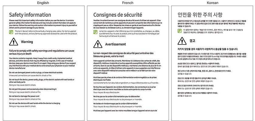
In languages such as French, German, and Spanish, sentences often run about 20% longer than in English, so the same safety information page can hold a noticeably larger volume of text. As the example below shows, content that fits on a single page in English can run past the page in French.
For this reason, it helps to reserve three or four lines of white space below text areas when designing the source page. A source with expansion room keeps its page flow after translation. A tightly packed source lets the translated text spill onto the next page and break the layout that follows.
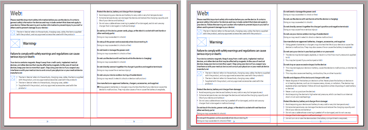
This is especially important for premium appliances, beauty devices, and other consumer products with dense page designs. A few additional lines can change the visual balance of the entire page. Considering this at the source stage reduces the need to shrink text or move elements after translation.
Separate Translatable Text from Graphics
Consumer product manuals often combine product images and text into a single visual composition. This can look clean in English, but it creates additional localization work when text is embedded directly in the graphic or callout positions are designed around a specific English label length.
Where possible, use numbers or symbols in the image and manage the corresponding descriptions as separate text. The objective is not to simplify the visual design. It is to make the design flexible enough to accommodate language changes.
Design Tables and Text Boxes for Text Expansion
Consumer medical device and wellness product manuals may use tables for specifications, operating conditions, contraindications, cleaning instructions, and storage information. If column widths and row heights are fixed to English text, localization may force the DTP team to reduce the font size or insert awkward line breaks.
As the example below shows, the same table content takes a different number of lines in English and Hindi. If row heights are not designed to grow with the content, the table has to be reworked in every language.
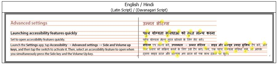
Avoid placing too much information into tightly fixed tables when possible. When a table is the clearest way to present information, give text-heavy columns enough room and allow text boxes and surrounding elements to accommodate content growth. This reduces the amount of language-by-language layout adjustment.
Use Styles Instead of Manual Formatting
An InDesign file can look perfectly consistent even when headings, body text, captions, tables, and notices have been formatted manually on individual pages. Problems often appear later, when content is exported for translation, imported again, or updated across many localized files. As the example below shows, formatting applied manually without styles can be lost or displayed differently during translation.
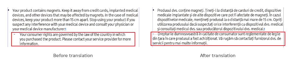
Using Paragraph Styles, Character Styles, Table Styles, Cell Styles, and Object Styles makes multilingual DTP and global formatting changes more predictable. Styles are more than an editing convenience. They turn the visual rules of the source manual into reusable production rules that can be applied across languages and follow-on product models.
Plan for Language-Specific Typography
The font size and line spacing that work well in English will not necessarily work equally well in every language. Different writing systems and fonts can create different levels of visual density even at the same point size. Scripts with taller glyphs, such as Thai, Khmer, and Bengali, can overlap and lose readability when English line spacing is applied unchanged, as the example below shows.
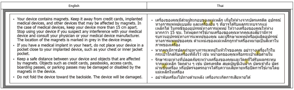
If your documentation team produces multilingual user manuals on a regular basis, it helps to establish basic typography and layout rules for major language groups. This is more reliable than asking individual DTP operators to solve the same typography problems independently each time, and it also makes QA more consistent.
Consumer Medical Device IFUs Need More Than Flexible Layouts
For consumer medical device IFUs and user manuals, flexible page design alone is not enough. Instructions, warnings and precautions, operating conditions, contraindications, storage and maintenance information, and content connected to product labeling need to be clearly structured.
If market-specific information and globally shared information are mixed together in the source, it becomes harder to track what should appear in each language and market as the number of releases grows. A well-structured source makes this easier to control during technical documentation localization.
For this reason, designing a source manual for multilingual use is not simply about adding white space. It requires both layout flexibility and content structure.
The Goal Is to Reduce Multilingual DTP Rework
Designing the source manual for localization does not eliminate multilingual DTP. Languages still differ in sentence length, writing systems, fonts, and typographic requirements.
But if every localized version requires smaller text, rebuilt tables, repositioned images, or repeated callout adjustments, the source design deserves another look.
A localization-ready source reduces unnecessary DTP rework and makes translation schedules and QA more predictable. For manufacturers that release new models and product variants regularly, the value becomes even greater because page structures, styles, image conventions, and typography rules can be reused in future manuals.
Multilingual Manual Production Starts with the Source
If a product is going to be sold in multiple countries, multilingual manual production does not have to begin after the English manual is finished. The documentation team can consider translation, localization, multilingual DTP, QA, and future updates while the source manual is still being developed.
If text repeatedly overflowed in previous localized versions, the next source layout can provide more room. If formatting repeatedly broke across languages, those elements can be standardized with styles. If image localization required excessive editing, the next product manual can separate graphics from translatable text. In other words, experience from localization should feed back into the next source design.
For manufacturers preparing beauty devices, wellness products, consumer medical devices, premium appliances, or other consumer products for global markets, this approach can reduce downstream rework and make multilingual releases easier to manage.
The quality of a multilingual user manual depends on more than good translation. If a manual is expected to support multiple languages, multilingual production has already begun when the source manual is being designed.
If your team needs multilingual user manual development or localization, Hansem Global can support source manual development, translation, localization, multilingual DTP, and QA in one workflow.