


Built for Reuse: Redesigning the Cluster Section of an Industrial Equipment Manual
An equipment manufacturer's operator manual carried 55 pages on the instrument cluster. In the redesigned North American edition, the same subject runs 22 pages. Replacing screenshot sequences with lookup tables and text procedures cut the length by more than half while increasing what the operator actually receives. The larger gain is that this technical content can now be reused across model variants, language editions, and web channels.
Screenshots are the cheapest thing to make and the most expensive thing to change. One screen changes, and every page it sits on has to be rebuilt.
Project Summary
In construction and industrial equipment manuals, the cluster section is where page counts swell. Menu items get documented in the order the screens appear, and a capture goes in at every step. The source manual in this project followed that convention, and the cluster section alone ran 55 pages.
In the redesigned North American edition, the same subject became “Instrument cluster” and “Cluster menu” at 22 pages, a 60 percent reduction. Length dropped by more than half while the information the operator receives went up. The method had more to do with changing the form of expression than with deleting content. That change also moved the material into a structure that survives the next model and the next language edition.
| Client | Construction and industrial equipment manufacturer |
| Product | Electric industrial vehicle series with variants by tonnage class |
| Source document | Operator manual, cluster section, 55 pages |
| Delivered document | North American edition, “Instrument cluster” and “Cluster menu,” 22 pages |
| Findings | (1) Menu procedures written as screenshot chains, with 394 figure placements and one screen repeated up to 41 times (2) Information organized against the way operators work (3) No separation between operator and service audiences |
| Redesign | (1) Table formats matched to information type (2) Status messages rebuilt for lookup (3) Screenshot chains converted to text procedures (4) Audience separation (5) A reuse structure for variants and language editions |
Challenges
This format is hard to pin on any one manufacturer. Forklifts, excavators, wheel loaders, cranes, and agricultural machinery share it. Cluster and control panel menus get listed in mechanical order, with a screen capture placed at every step.
At the moment of production, a capture is the cheapest thing a writer can put on a page. Pasting a screen removes the work of defining the action in a sentence, and reviewers can check the page against the machine by eye. The cost arrives after production ends, and it usually lands on whoever owns the next revision or on the localization process.
The source manual showed exactly that result.
- Procedures written as screenshot chains. Documenting one menu item meant publishing a capture for every step, from opening the equipment menu through the confirmation screen. The cluster section alone carried 394 figure placements, and the main menu entry screen appeared 41 times. A minor setting consumed four to ten captures, which pushed the menu portion to 35 pages.
- Information organized against operator workflow. An operator wants to know which control produces a speed limit, not what the menu screen looks like. When a warning appears, the operator wants to look up that message text and find the cause and the required action. The source manual placed a one-line caption beside each capture, which forced a visual match between the screen and the page.
- No separation of operator and service audiences. Roughly 16 pages of service-only parameters sat in the operator manual, covering pedal voltage, hydraulic valve current, and steering calibration. In the language of IEC/IEEE 82079-1, the target group and the information type had not been separated.
Our Solutions
1. Repeated blocks became a lookup table: warning and indicator lamps
The source manual stacked an icon and a description block on the page for every lamp, running about nine pages. The redesigned edition rebuilt this as a four-column table covering icon, name, illumination condition, and consequence with required action, in five pages. The page count fell and the information grew. A Warning column that had no counterpart in the source now states the consequence of ignoring each indicator. A brake pump motor temperature warning carries loss of braking and an immediate stop instruction. A high-voltage battery warning carries shock and fire risk with a restart prohibition. Temperature thresholds appear in dual units, 311 °F (155 °C), and differences between tonnage variants are absorbed inside the table.
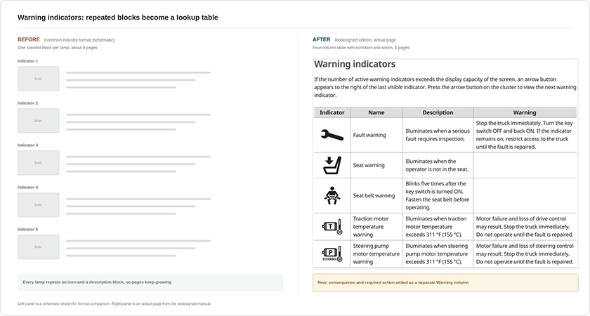
Figure 1. Warning indicator formats compared. The left panel is a schematic of the common industry layout. The right panel is an actual page from the redesigned manual, where consequence and required action appear as a new column.
2. A screenshot grid became a message dictionary: status displays
Interlock and notification messages were presented as six captures in a grid, each with a caption such as “instructs the operator to move the direction lever to neutral.” The redesigned edition changed the premise. The message text shown on the cluster now sits in the first column of the table, exactly as the operator sees it. The operator matches the sentence on the screen to the same string in the table and reads the condition and the required action. Looking something up by the words on the display is how the task actually happens. Charging status and BMS status tables follow the same form, and a transmission limit message table and an ANSI Z535.6 warning panel on interlock bypass were added where the source had none.
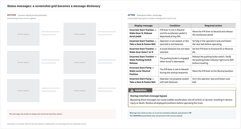
Figure 2. Status message formats compared. The capture grid on the left becomes a lookup table carrying message text, condition, and required action. Because the message exists as text, an operator can search for it.
3. Screenshot chains became text procedures: menu operation
The largest reduction came from the menu portion, which went from 35 pages to 8, a 77 percent cut. The redesigned edition presents the whole menu structure once in an overview table covering main menu, sub-menu, and settings, then describes each operation as short numbered steps with no captures. What a user needs in order to follow a procedure without a photograph is an accurate rendering of the menu name. Substantive information such as setting ranges and password policy was kept and reinforced.
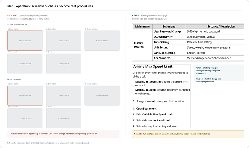
Figure 3. Menu operation formats compared. The left panel is a schematic of a screenshot chain, where one setting consumes ten captures. The right panel is an actual page from the redesigned manual.
Outcome
Everything above happened inside one manual. For a manufacturer, what comes next matters more. A manual does not get made once. Variants ship, language editions multiply, software gets revised, and print moves to the web. The choice of expression format decides the cost of all of it in advance.
A screenshot chain blocks reuse along five axes at the same time.
| Reuse axis | Screenshot chain | Table and text procedure |
| Model variants | Captures rebuilt wherever screens differ by model | Differences absorbed by a condition column |
| Language editions | Every capture remade per UI language, requiring image localization | Translation of strings completes the work |
| Software revisions | Every page carrying that screen has to be updated, up to 41 in this project | One string search and one edit |
| Channel changes | Locked to print page layout, re-edited when moved to web | Ports directly to HTML, web manuals, and service portals |
| Search and machine reading | Text lives inside an image and cannot be indexed | Message text exists as text and can be searched and indexed |
Text inside an image cannot be found
The last axis has gained weight in the past few years. Letters inside a capture are visible only to a human eye. They do not appear in a PDF search. They are not indexed when the manual moves to the web, and they never accumulate in translation memory. Whether an operator can type the message from the cluster and find the required action is a question the document structure already answered.
Manufacturer technical documentation is increasingly the source that search engines and AI assistants draw on, and information that does not exist as text is excluded from that pool before the question is even asked. Putting the message text in the first column was an editorial decision about page count and a structural decision about where that information can travel next.
What single sourcing actually requires
Once differences between models are absorbed by a condition column in a table, one master document can branch into derivative manuals. That is single-source operation, and it does not arrive with a tool purchase. Any content that will not divide into reusable units gets copied wholesale by the system instead, and screenshot chains are the classic leftover. This redesign served the operator and lowered the structural cost of every manual that follows it.
Conclusion
| Item | Before: common industry format | After: redesigned edition |
| Length | 55 pages | 22 pages, a 60 percent reduction |
| Menu portion | 35 pages of screenshot chains | 8 pages of overview table and numbered steps, a 77 percent cut |
| Figure placements | 394, with one screen repeated 41 times | Limited to layout diagrams and control callouts |
| Warning indicators | About 9 pages of individual blocks | 5 pages in a four-column table with a new consequence column |
| Status messages | Capture grid with one-line captions | Lookup table keyed to message text, plus a new transmission limit table |
| Audience | About 16 pages of service parameters mixed in | Marked “* Service personnel only” and excluded |
| Revision handling | Every page carrying the changed screen is rebuilt | One UI string edit completes the revision |
| Language editions | Image localization required for every UI language | Image work disappears, string translation only |
| Channel reach | Locked to print layout | Ports to web manuals and service portals |
| Search and indexing | Messages trapped in images | Text is searchable, indexable, and available to AI answers |
The cluster section was an exercise in turning content into something that can be used again. The standard behind it is simple. The unit of a document is the operator’s task, not a screen or a feature. A screen capture looks generous on its own, and a run of captures that ignores the task becomes a liability that adds pages and maintenance cost. Once the format matched the type of information, the section lost 60 percent of its length and gained accuracy. The production economics of every derivative manual changed with it.
Frequently asked questions
- How should a manufacturer with many model variants structure an equipment manual? Branching model differences through body text multiplies documents by the number of variants. Absorbing those differences into a condition column lets one master document branch into derivative manuals. In this project, tonnage differences were handled inside the warning indicator table and the menu overview table, which produced a single-source structure without separate documents.
- Are more screenshots in a menu section not more helpful to the reader? More captures look helpful, but what a user needs is not the order in which screens appear. The user needs to know which situation calls for that screen. A screen placed according to the task and the goal earns its space. A screen placed in sequence does not.
- Does a screenshot-heavy manual make web conversion difficult? The conversion itself works. The problem is that letters inside a capture are not indexed, so users cannot find them by search after the move. The main advantage of a web manual is search, and that part stops working.
- Does cutting the length of a technical manual make it less complete? Deleting and compressing are separate things. This project removed repeated captures and added a consequence column, a transmission limit message table, and a warning panel that the source did not have. The section went from 55 pages to 22 while the operator gained information.
- Why separate operator content from service information? Service parameters an operator should never touch make the document heavier and create the risk that a user alters control settings. IEC/IEEE 82079-1 also calls for information to be separated by target group. In this project those menus were marked “Service personnel only” and excluded from the body.
About Hansem Global
Hansem Global has developed technical documentation and localized it into more than 100 languages since 1990. The company holds ISO 17100, ISO 18587, and ISO 27001 certification, along with ISO 9001 scoped to the manual development process itself. Hansem Global ranked 37th in the 2026 CSA Research Verified 100, an annual ranking of the world’s leading language and global content solutions providers.
For questions about the TM management procedures described here, or about multilingual technical documentation for derivative manual programs, contact Hansem Global through the company website.